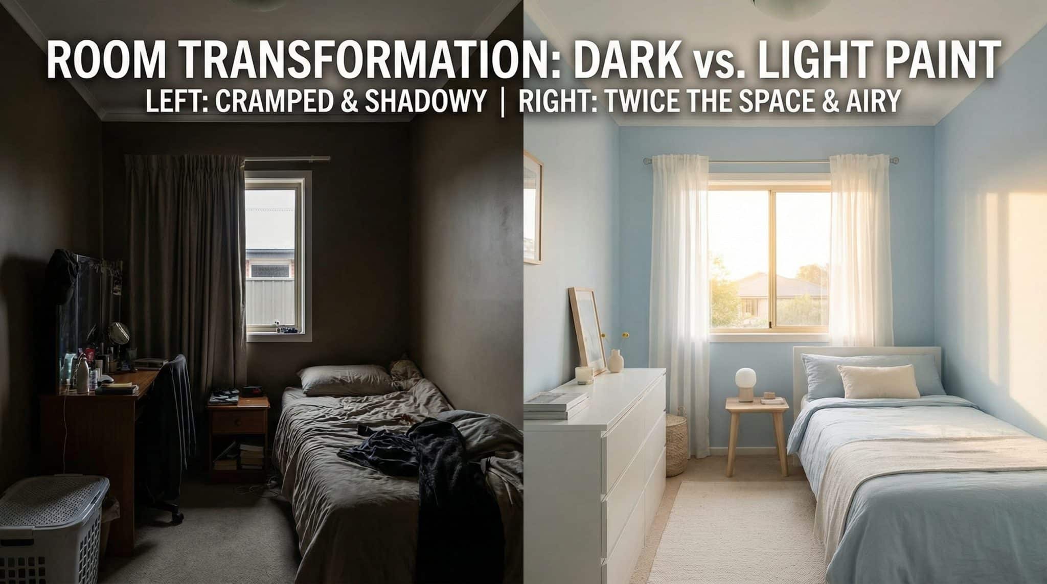

This Paint Trick Instantly Transforms Small Rooms (No Sledgehammer Required)
If you’ve ever stood in a tiny room and thought, “Why does this feel like I’m inside a carry on suitcase?” you’re not being dramatic. (Okay, maybe a little. But still.) Color really can make walls feel like they’re inching toward you… or backing off and giving you some personal space.
I’m not saying paint is magic. But I am saying I’ve watched a small, cranky bedroom go from “claustrophobic college rental” to “calm little retreat” with nothing but the right shade and a weekend of mild chaos. So let’s talk about the paint trick that actually works, plus the handful of decisions that make or break it.
The “Small Room” Problem Is Partly… Your Eyeballs
Your brain is basically walking around with a measuring tape, constantly estimating distance. And color messes with that in a very real way:
- Warm colors (reds, oranges, strong yellows) tend to visually advance like the walls are leaning in for a hug you did not consent to.
- Cool colors (blues, greens, soft purples) tend to visually recede like the walls are politely backing up to give you room to breathe.
So yes, you can absolutely paint your tiny office burnt orange… but don’t be surprised if it starts feeling like the walls are closing in like a suspense movie.
The other not sexy but important piece: Light Reflective Value (LRV). It’s a 0-100 scale that basically tells you how much light a color bounces around. In small rooms, higher LRV helps soften shadows in corners (and corners are where small rooms go to look extra boxy).
My sweet spot for small rooms: aim roughly for LRV 60-75. Bright enough to open things up, but not so stark you feel like you’re living inside a blank Word document.
Before You Pick a Color, Figure Out What Your Windows Are Doing
This is where people get burned. The same paint can look dreamy in one house and tragic in another purely because of light direction. I’ve personally had a “perfect soft white” turn into “why is my room the color of oatmeal?” in a north facing space. Humbling.
Here’s the quick and dirty version:
- North facing light: cooler, steady, can make colors feel sharper/colder. Try warm off whites or slightly creamy tones so you don’t end up in an ice cave.
- South facing light: bright and warm, can make warm paint feel extra warm. Cooler whites and soft blues/greens balance it.
- East facing light: warm in the morning, more neutral later. Many light blues and soft greens behave nicely here.
- West facing light: calmer earlier, then turns into golden hour drama by late afternoon. Watch warm undertones they can get loud. Cooler neutrals help.
And please, for the love of sanity: check your bulbs. If you pick a warm creamy paint and then light it with super cool LEDs (4000K+), it can go weird and dull fast. For warm off whites, I usually like bulbs around 2700K-3000K.
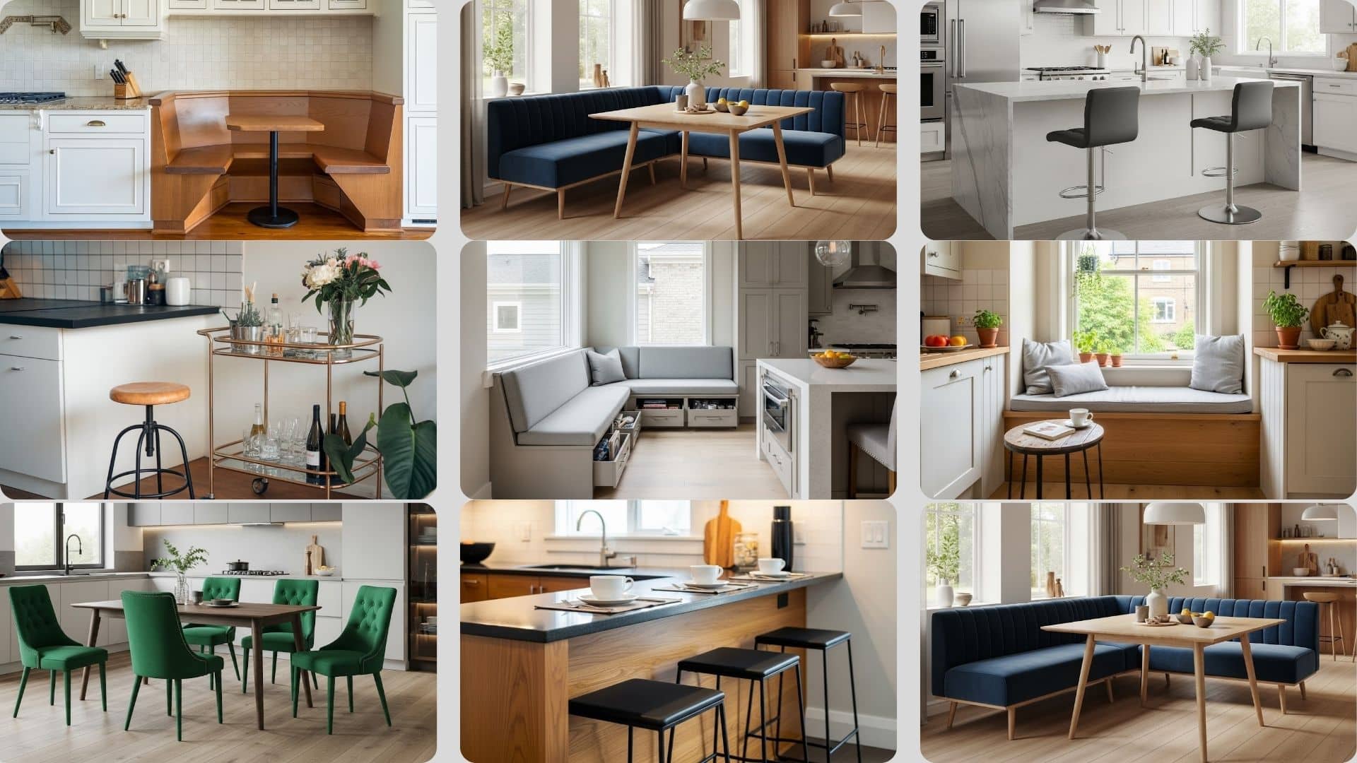
Okay, So What Colors Actually Make a Small Room Feel Bigger?
I’m going to give you the “real life” short list the stuff that tends to work in actual houses with actual weird corners and questionable overhead lighting.
1) Soft Off Whites That Don’t Feel Like a Hospital
If you want the safest “make it feel bigger” move, it’s a good off white with a gentle undertone.
- Benjamin Moore White Dove: warm, soft, and doesn’t scream “new construction flip.”
- Benjamin Moore Simply White: brighter, great when the room is starved for daylight.
My opinion: undertone matters more than the label “white.” A cool white in a north facing room can feel harsh. A creamy white under the wrong bulbs can look… unexpectedly beige. Test first (we’ll get there).
2) Light Blue Greens That Make Walls Back Up
If you want that “ahhhh” feeling, soft blue greens are ridiculously good at it. They’re calming, and they visually recede.
- Sherwin-Williams Silver Strand: a gray blue green that feels grown up.
- Benjamin Moore Abalone: a light, airy green leaning neutral that stays pretty stable through the day.
One big caveat: blue can get cold fast in dim rooms. If your “natural light” situation is basically “one sad window facing a brick wall,” I’d lean green leaning or warm neutral instead of a true blue.
3) Warm Neutrals (Greige/Taupe) for When Light Is Being Difficult
If you’ve tried whites and they look weird, and you’ve tried blues and they look icy, this is where greige earns its paycheck.
- Sherwin-Williams November Rain: a nice balanced neutral that doesn’t swing too yellow or too gray.
Also: in a windowless space, pale warm tones can be surprisingly helpful. A soft cream or gentle yellow can fake a little sunshine. (Not “school bus.” Think “butter that costs $9.”)
4) The Sleeper Hit: Soft Lavender (Not Nursery, I Promise)
Listen. I know lavender sounds like it’s going to come with ruffles and a stuffed bunny. But a gray lavender can be so good in a small bedroom because it’s calm like blue, without the icy vibe.
- Benjamin Moore Lavender Secret: soft, muted, and pretty in low to medium light.
If you want “something” but you’re scared of color, this is a sneaky, very flattering option.
The Paint Trick That Makes Small Rooms Feel Bigger: Remove the Visual “Stops”
Here’s the trick: the more contrast lines your eye hits, the smaller the room feels. Small rooms already have a lot going on (doors! corners! trim! awkward bumps!). If you outline every edge in bright white trim and change colors at the ceiling line, your eye is basically tracing a tiny box.
So the move that works ridiculously well is:
Paint more surfaces the same color (or close to it)
You can go full commitment and paint walls + trim + ceiling the same shade (aka color drenching), or do a softer version like:
- Walls: your chosen color
- Ceiling: same color, or ~20% lighter
- Trim: same color (just a different sheen), or a very close white
When everything blends, your eye stops measuring every single edge… and the room feels calmer and larger. It’s like your space finally unclenches its jaw.
My take: builder bright white ceilings can look like a hard “lid,” especially in tiny bedrooms. Matching the ceiling to the wall color can be a game changer.
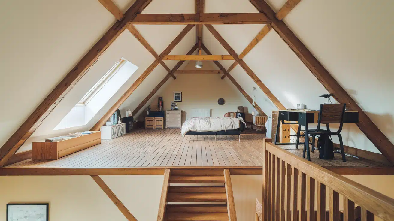
Yes, You Can Use Dark Paint in a Small Room (But Don’t Get Cocky)
Dark paint in a small room can look incredible. It can also look like you willingly moved into a cave. The difference is a few conditions.
If you want to go dark, I’d stick to this:
- One accent wall max (unless you’re intentionally doing a cozy, moody vibe).
- Decent natural light most days (or you need a lighting plan that isn’t one sad overhead boob light).
- Keep the ceiling lighter (or match it on purpose for mood no awkward in between).
- Bring contrast in furniture: lighter upholstery, brighter art, mirrors, metallics something to bounce light.
If you want a tried and true dark that doesn’t feel like a corporate boardroom, Benjamin Moore Hale Navy is a classic for a reason.
Where I actually love dark paint: powder rooms. You’re not living in there. You’re visiting. Let it be dramatic. Let it be fabulous. (Just make sure you have good lighting so nobody’s doing their makeup in a haunted house.)
Pick the Right Finish So the Room Doesn’t Look… Weird
Finish matters more in small rooms because light is limited and every little bump in the wall wants attention.
Here’s my simplified cheat sheet:
- Ceiling: flat/matte (hides flaws, no glare)
- Walls: eggshell or satin (I lean satin in small darker spaces for a bit more light bounce)
- Trim/doors: satin or semi gloss (wipes clean, reflects light nicely)
If your walls are imperfect (and whose aren’t?), skip high gloss on walls unless you want to spotlight every patch job like it’s on stage.
Test Your Paint Like a Person Who Doesn’t Want to Repaint (Again)
Paint is the ultimate catfish. It looks amazing online. It shows up at your house and acts completely different.
What works best for me:
- Paint big samples on foam boards (two coats) and move them around.
- Check morning, afternoon, and night under your actual lamps.
- Give it 2-3 days. One sunny afternoon is a liar.
If a color looks wrong at night, it’s wrong. Night is when you actually live in most rooms (and when small rooms tend to feel their smallest).
Common Mistakes That Make a Small Room Feel Smaller (Ask Me How I Know)
- High contrast everywhere: dark walls + bright white trim outlines the room like a cartoon drawing. Soft transitions feel bigger.
- Clashing undertones: warm wall paint with a cool white trim can make everything feel “off,” and your brain reads that as visual clutter.
- Wrong bulbs: warm paint under very cool LEDs can go yellow/flat. Cool paint under very warm bulbs can go muddy.
- Overdoing busy patterns: big bold prints can make tiny rooms feel frantic. Texture and tone on tone are your friend.
Quick Styling Cheats That Add Even More “Space”
Once the paint is doing its job, these stairwell and landing styling tweaks help the room feel even more open:
- Mirrors: best placed across from your main light source (not shoved in a dark corner like an afterthought).
- Hang curtains high: close to the ceiling, not right on top of the window frame. Instant height.
- Leggy furniture: seeing more floor makes the room feel bigger. Skirts and bulky bases hide floor space and visually “weigh down” the room.
When It’s Worth Calling in a Color Consultant
If your room has tricky light (hello, north facing cave), or you’re trying to make several rooms flow together and you’re spiraling into paint swatch madness, getting help can actually save money. Because repainting is not just expensive it’s emotionally disrespectful.
If you do hire someone, ask how they evaluate lighting at different times of day and whether they’ll factor in your existing floors/cabinets along with durable hallway floor options. If they just toss out generic color names without digging into your space, keep your cash and buy yourself a fancy sample pack instead.
The Bottom Line
If you want a small room to feel bigger, don’t just grab “a light color.” Go for a higher LRV shade with the right undertone for your window direction, and use the real trick: reduce harsh contrast lines so your eye stops measuring every edge.
Pick 3 colors. Test them. Watch them in your real light. And then commit like the confident, roller wielding powerhouse you are.