
Oak furniture brings timeless appeal to any home, but choosing the wrong colors can make even the most beautiful pieces look outdated or out of place.
The secret lies in understanding how oak’s warm undertones interact with various color palettes, a detail that most decorating guides overlook completely. This is especially true in the living room, where balance and flow matter.
Many homeowners struggle with this exact problem. They invest in high-quality oak pieces only to find that their rooms feel disconnected or bland.
The issue isn’t the furniture; it’s knowing which colors create harmony versus chaos.
This guide breaks down proven color combinations that make oak furniture look intentional and stylish.
You’ll learn the difference between light and dark oak undertones, find room-specific color strategies, and get practical tips for walls, décor, and flooring that work together beautifully.
How to Identify Oak Furniture Tones?
Oak furniture comes in two main categories that significantly alter how you approach color pairing.
Light oak has honey and golden undertones that work beautifully with warm colors, such as creams, soft yellows, and sage greens.
In contrast, dark oak features deeper brown and sometimes reddish undertones that pair perfectly with cooler shades, such as greys, navy blues, and crisp whites.
The secret lies in matching warm undertones with warm colors and cool undertones with cool colors, creating a natural harmony in your space.
Oak’s incredible versatility stems from its neutral base, making it work equally well in cozy traditional homes with rich, warm palettes or sleek modern spaces with clean, minimalist color schemes.
Warm vs Cool Undertones in Oak Wood
Oak wood can have warm golden hues or cool grayish tones, and knowing the difference helps you choose colours that truly complement your furniture.
| Light Oak Characteristics | Dark Oak Characteristics |
|---|---|
| Honey and golden undertones | Deep brown and reddish undertones |
| Works with warm colors (creams, yellows, terracotta) | Pairs with cool colors (greys, blues, whites) |
| Creates a bright, airy feeling | Adds richness and depth |
| Perfect for Scandinavian and farmhouse styles | Ideal for modern and traditional luxury looks |
| Best with warm metallics (brass, gold) | Stunning with cool metallics (silver, black) |
15 Colours That Complement Oak Furniture
From soft neutrals to bold accents, these colour ideas highlight oak’s natural beauty and help you create a balanced, stylish space
1. Soft White
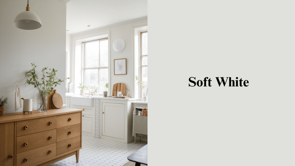
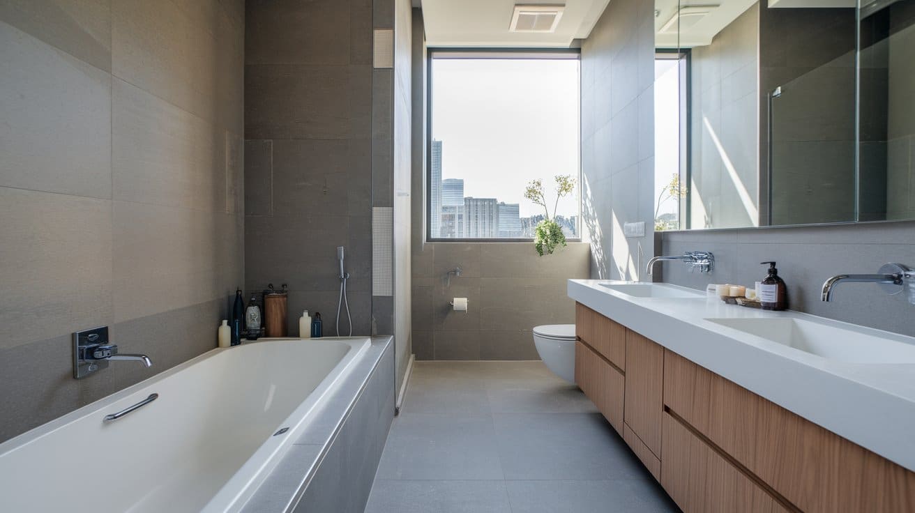
Creates a bright, airy backdrop that highlights the natural grain of oak. This classic pairing makes rooms feel larger while letting your oak pieces take center stage. Works perfectly in kitchens, bathrooms, and modern living spaces. Layer with warm gray textiles to avoid starkness.
2. Warm Cream
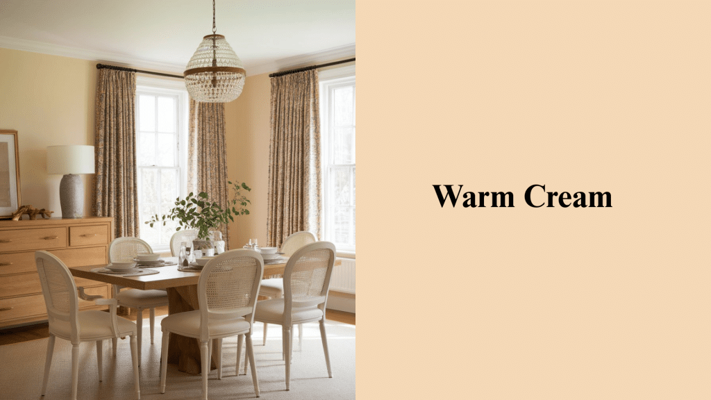
Adds coziness and pairs beautifully with both light and dark oak. The subtle warmth prevents stark contrast while maintaining a fresh, inviting atmosphere. Ideal for bedrooms and traditional dining rooms. Introduce yellow accents sparingly for a sunny lift.
3. Light Grey
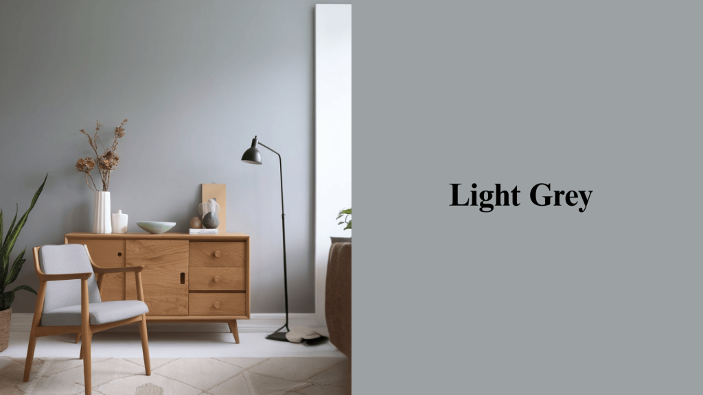
A modern neutral that balances oak’s warmth without competing for attention. This refined shade works particularly well in contemporary homes and open-plan spaces. Perfect backdrop for showcasing oak furniture collections. Ideal in a living room with clean lines.
4. Charcoal Grey
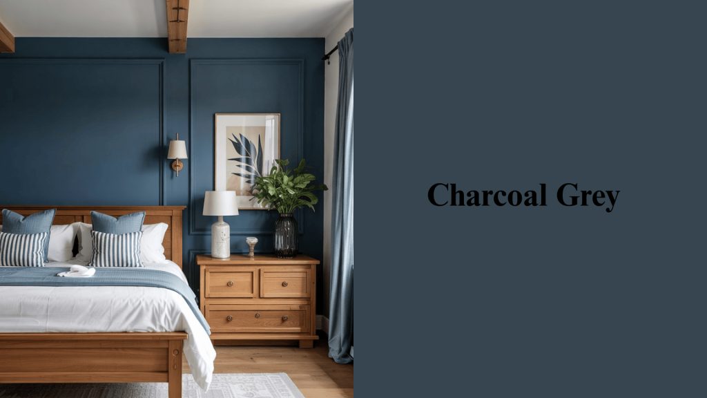
For bold, dramatic contrast in contemporary interiors that need visual impact. The dark tone makes light oak furniture appear more vibrant while creating a luxurious, hotel-like feel. Best used as accent walls rather than entire rooms.
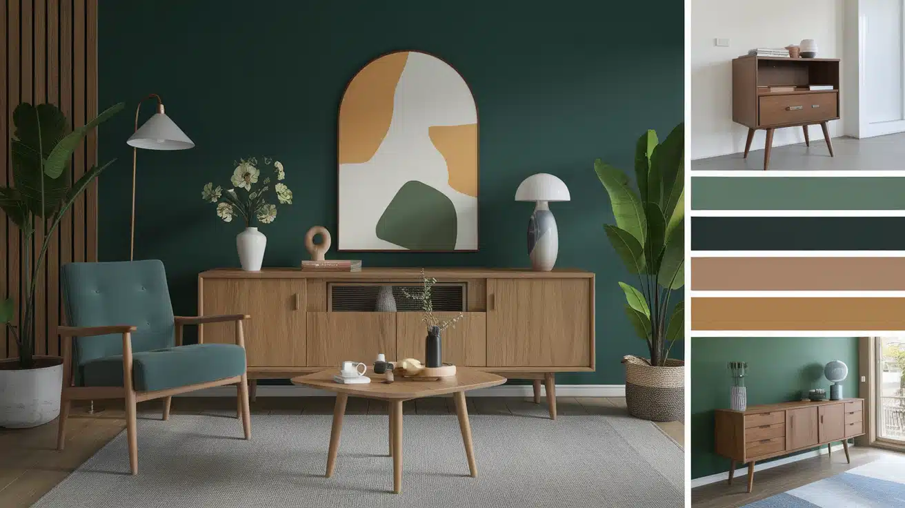
5. Sage Green
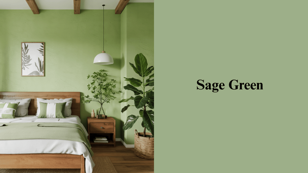
Earthy and calming, it pairs perfectly with the organic vibe of oak for nature-inspired interiors. This muted green brings tranquility to bedrooms and living areas, complementing the natural wood tones of oak. Popular choice for modern farmhouse styles.
6. Olive Green
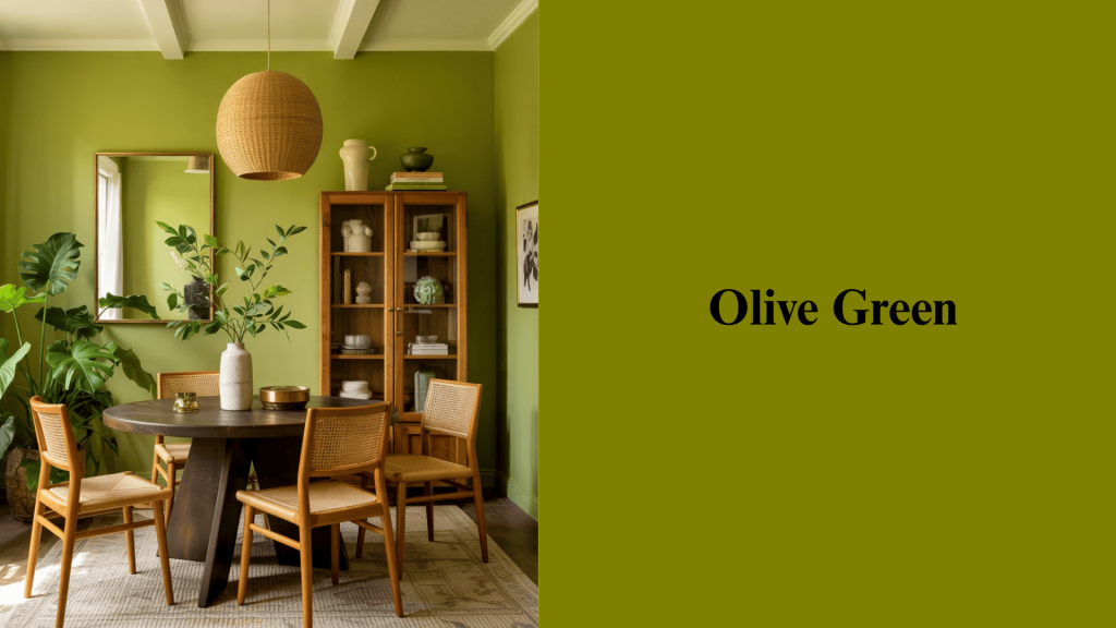
Richer green that adds depth to oak dining or living rooms without overwhelming. Creates a refined, grounded feeling that works beautifully with brass hardware and warm lighting. Excellent for creating cozy, intimate spaces.
7. Navy Blue
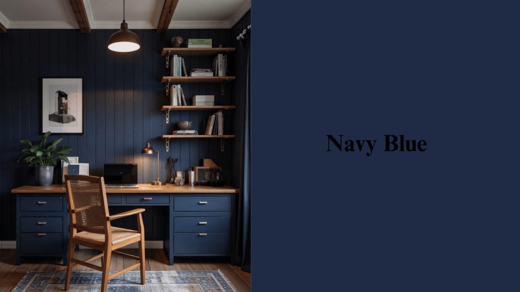
A refined, high-contrast choice that makes oak pop in any room setting. This timeless color adds depth and richness while maintaining a classic, nautical-inspired feel. Works wonderfully in home offices and reading nooks.
8. Deep Teal
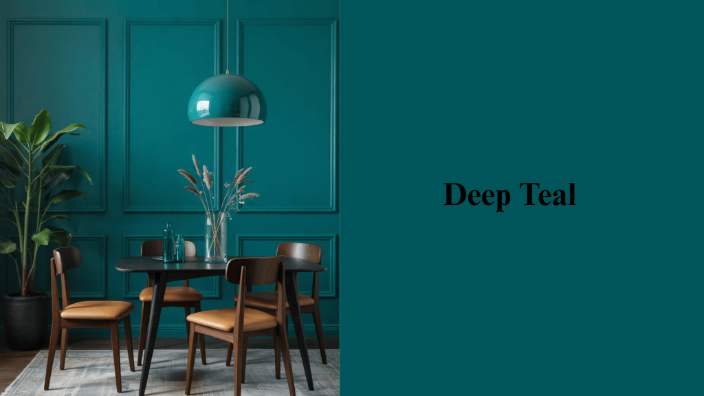
Combines richness and vibrancy, especially when paired with dark oak for a dramatic effect. This jewel tone creates a luxurious atmosphere that remains fresh and current. Perfect for accent walls in dining rooms or master bedrooms.
9. Soft Pastel Blue
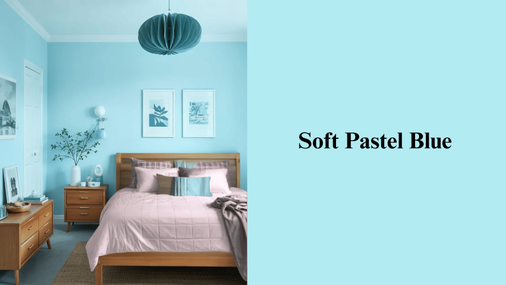
Light, breezy, and calming for bedrooms with oak furniture pieces. This gentle shade creates a peaceful retreat while complementing the oak’s warm undertones beautifully. Ideal for children’s rooms and guest bedrooms.
10. Blush Pink
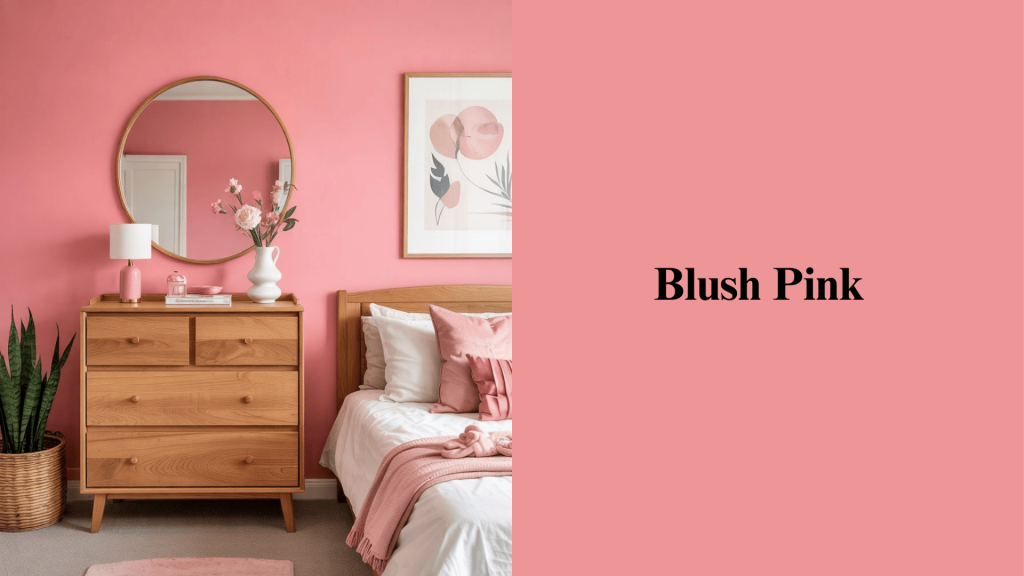
Adds a soft, modern twist without overpowering the natural beauty of oak. This subtle color creates warmth and femininity while remaining cultivated and current. Works well in bedrooms, nurseries, and powder rooms.
11. Terracotta
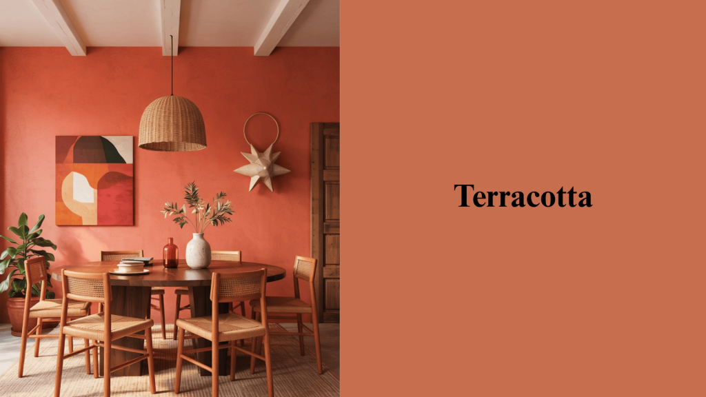
Warm, earthy, and rustic, echoing oak’s natural undertones for cohesive design. This rich orange-brown creates a cozy, Mediterranean-inspired atmosphere that feels both timeless and trendy. Perfect for dining rooms and kitchens.
12. Mustard Yellow
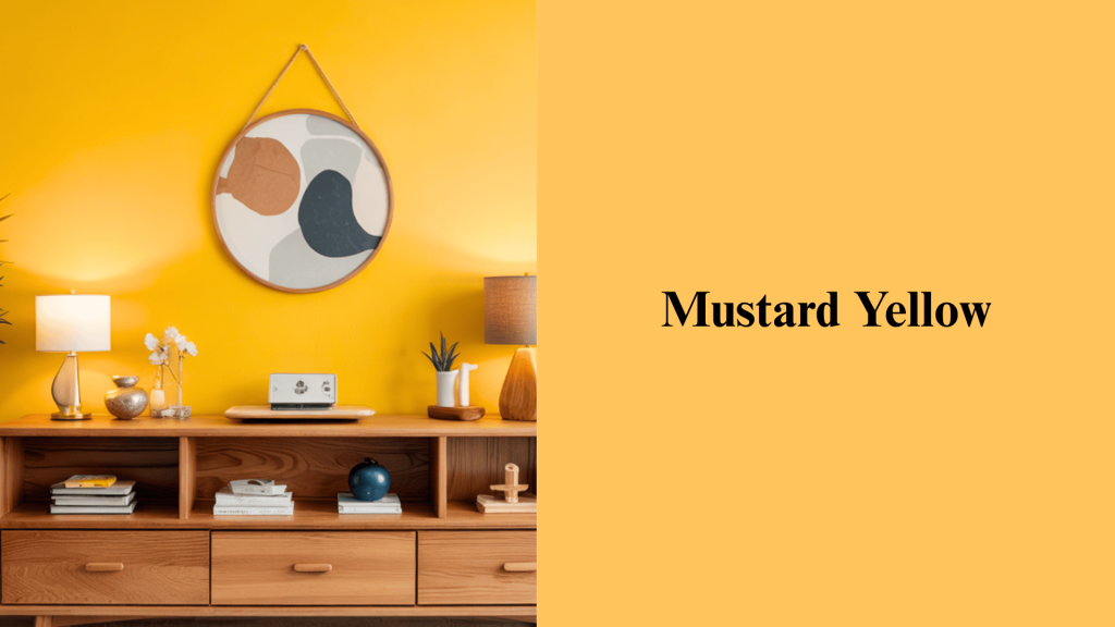
Energetic and inviting, great for accent walls or décor pieces. This bold choice adds personality and warmth while complementing the oak’s natural golden undertones. Best used sparingly as statement pieces or feature walls.
13. Chocolate Brown
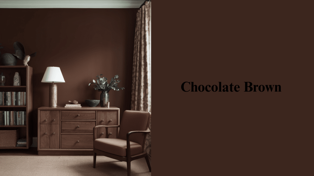
Tonal pairing that feels luxurious and grounded in natural materials. Creates a rich, cocoon-like atmosphere that makes oak furniture feel integrated and purposeful. Excellent for libraries, studies, and cozy living rooms.
14. Black
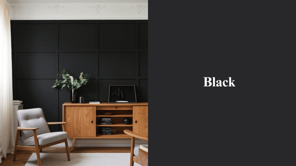
Sleek, modern, and striking when paired with oak accents for contemporary appeal. This bold choice creates maximum contrast while maintaining refinement and visual interest. Works best as accent elements rather than dominant wall colors.
15. Warm Lavender
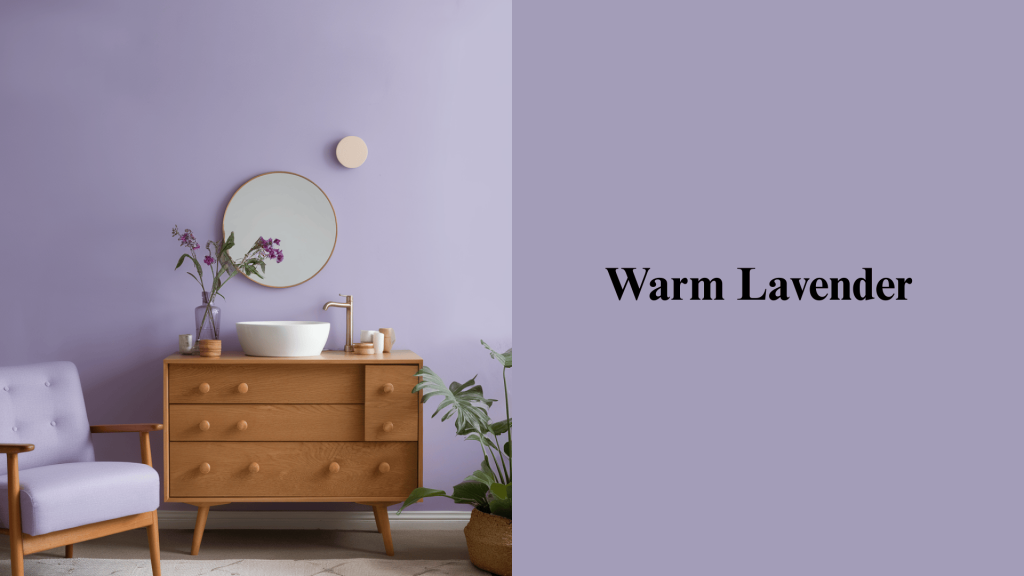
A soft, purple-grey that brings subtle refinement without overwhelming the natural warmth of oak. This gentle shade creates a calming, spa-like atmosphere while adding just enough color interest to feel fresh and current. Perfect for powder rooms, guest bedrooms, and accent walls in living spaces.
Flooring Colours That Go With Oak Furniture
The right flooring choice can change oak furniture, whether you want seamless harmony, striking contrast, or a cozy layered look.
| Flooring Option | Effect With Oak Furniture | Style Inspiration |
|---|---|---|
| Light Oak on Light Floors | Creates an open, airy feel | Scandinavian-inspired, minimalistic |
| Dark Oak on Light Flooring | Adds contrast and modern balance | Contemporary, high-contrast look |
| Medium-Toned Floors | Harmonizes oak with subtle blending | Transitional and timeless interiors |
| Carpet & Rugs | Ties colours together, adds warmth and softness | Layered, cozy, and versatile styling |
Colours for Every Room With Oak Furniture
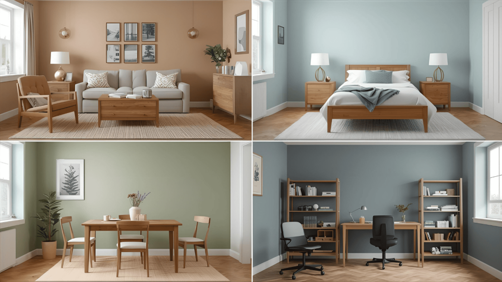
Find the perfect wall and décor colours for living rooms, bedrooms, dining areas, and more to make your oak furniture stand out beautifully.
1. Living Room
Warm neutrals, such as cream and soft beige, create a welcoming foundation that lets your oak furniture shine. Sample paint on large swatches to see how it reads throughout the day.
Add personality with pops of sage green through throw pillows and plants, or introduce navy blue accents via artwork and blankets. Style a coffee table tray that echoes these accent tones.
This combination keeps the space feeling relaxed yet put-together, perfect for both family time and entertaining guests.
2. Bedroom
Soft pastels, such as blush pink or powder blue, promote restful sleep while complementing oak bed frames beautifully.
Muted tones such as warm grey or gentle lavender create a calming retreat that feels serene and balanced.
These colors work especially well with oak nightstands and dressers, creating a cohesive, peaceful sanctuary.
3. Dining Room
Deep jewel tones, such as emerald green or rich burgundy, add complexity and create an intimate dining atmosphere.
These bold colors make oak dining tables and chairs appear more luxurious while encouraging longer, more enjoyable meals.
Consider deep teal or chocolate brown for accent walls that complement the natural richness of oak perfectly.
4. Home Office
Light grey walls provide a clean, professional backdrop that improves focus without being distracting.
Soft blues promote concentration and productivity while maintaining a calm and organized feel in the space.
These colors work particularly well with oak desks and bookshelves, creating a workspace that feels both efficient and inviting. Check the setup under varied lighting to maintain clarity on screen and page.
Tips for Colour Coordination With Oak Furniture
Use these expert tricks to balance undertones, play with psychology, and create colour schemes that bring out the best in your oak furniture.
- Balancing warm and cool tones: Mix one warm color (such as terracotta) with one cool accent (like soft grey) to create visual interest without clashing with the oak’s natural undertones.
- Using colour psychology: Choose calming blues for bedrooms and energizing yellows for kitchens to improve the functionality of each room while complementing oak furniture perfectly.
- Small-space tricks: Use lighter wall colors, such as cream or soft white, to make rooms with oak furniture feel more spacious. Alternatively, opt for darker colors, such as charcoal, to create a cozy and intimate atmosphere.
- Layering Textures: Combine linen throws, brass hardware, and ceramic accessories with oak pieces to add depth and prevent your space from looking flat or boring.
- Testing Samples First: Always hold paint swatches and fabric samples directly against your oak furniture in both natural and artificial light before making final decisions.
Conclusion
Oak furniture doesn’t have to limit your decorating options; it actually opens up countless possibilities when you understand undertones and color harmony.
From soft whites that brighten spaces to bold navy blues that create drama, these 15 colors prove oak works with virtually any style.
The key is matching warm oak with warm colors and cool oak with cooler tones.
Whether you prefer the calm of sage green bedrooms or the refinement of charcoal grey living rooms, oak adapts beautifully to your personal taste.
Remember, great design happens one room at a time. Start with your favorite space and experiment with one or two colors from this list.
Your oak furniture is waiting to shine. Give it the perfect backdrop it deserves, and watch your home convert.