
The Secret to a Staircase Gallery Wall That Doesn’t Look Like It’s Sliding Downhill
You know that moment when you finish hanging a staircase gallery wall, you step back feeling like a Design Genius™… and then your frames look like they’re slowly sledding into the basement?
That, my friend, is the dreaded diagonal “snake effect.” And it happens to perfectly normal, capable humans because our brains go, “Stairs are diagonal. Therefore the frames must also be diagonal.” Logical. Wrong. (Ask me how I know. I once made a whole staircase wall look like a polite avalanche.)
The fix is shockingly simple, and once you see it, you can’t unsee it.
The One Layout Rule That Changes Everything (Seriously)
Stop making a slanted ribbon. That’s the whole problem.
Here’s what you do instead:
- The bottom edge of your gallery can follow the stair angle (because yes, we live in reality).
- The top edge of your gallery should stay level (because your eyeballs crave order).
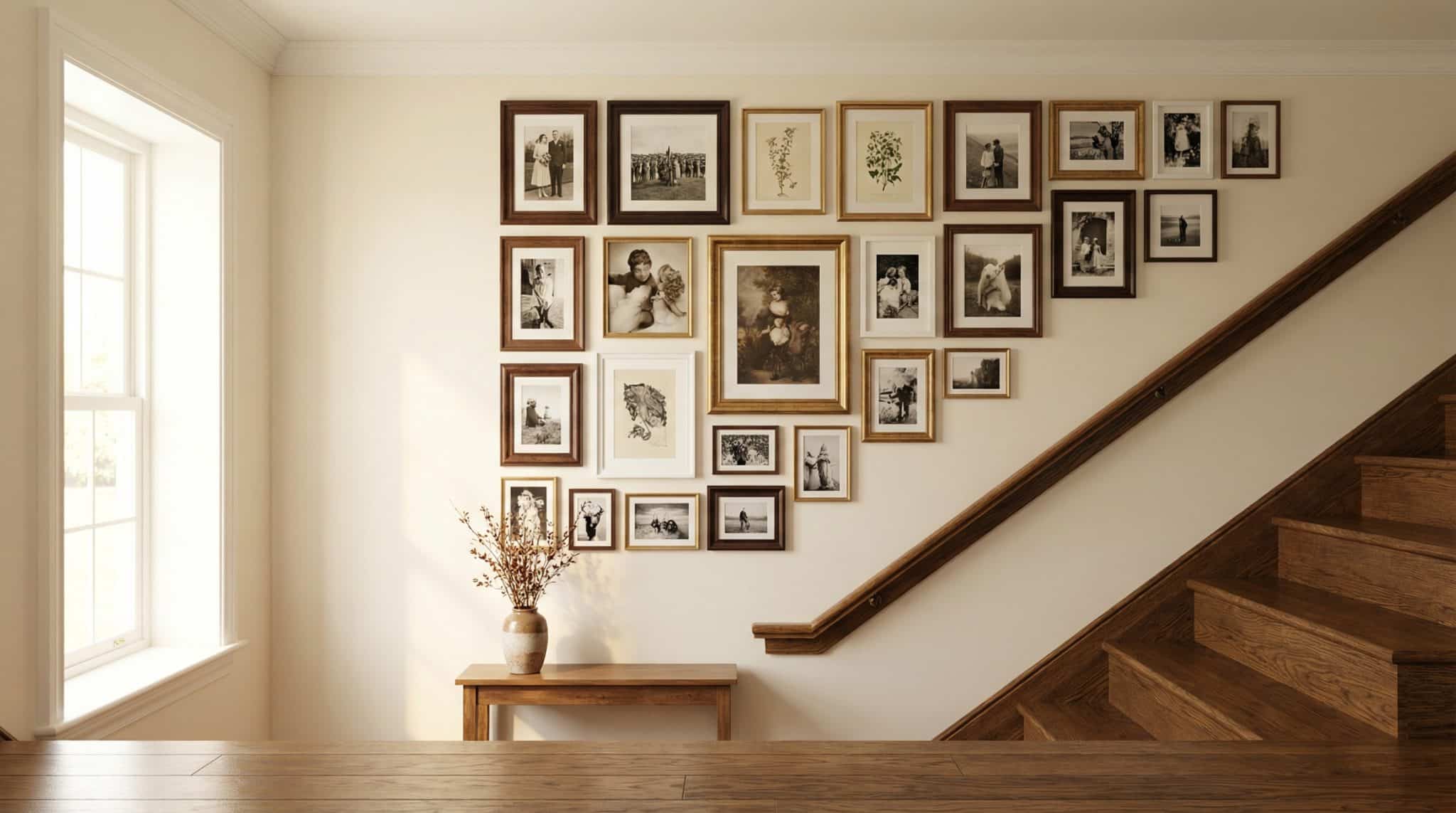
Think: a tilted rectangle, not a slanted stripe.
Stand at the bottom of the stairs and imagine you’re building one big “shape” on the wall. The bottom of that shape tilts with the stairs, but the top of the shape stays horizontal like it’s minding its own business near the ceiling. That’s what makes it look intentional instead of… tipsy.
Quick gut check before you hang anything: snap a photo from the bottom of the stairs. That’s the view that matters most, and you’ll keep coming back to it like it’s your gallery wall’s report card.
Frame Shopping: Yes, You Need the Frames First
I know it feels backwards. You want to “plan the layout” and then buy what you need like a responsible adult.
But staircase gallery walls are divas. You need the actual frames in your hands before you can plan properly because frame “sizes” are basically lies. A labeled 9×9 can be chunky, skinny, matted, unmatted… the outside dimensions are what matter.
My rule: buy/collect the frames first, then plan the wall. Future You will thank you (and Past You will stop drilling “practice holes”).
What sizes work best on stairs?
You’re walking right next to this wall. Like, close enough to notice if one frame is half an inch off and suddenly it looks like it’s plotting against you.
Stick mostly to small and medium frames (think 8×10 up to 16×20), and if you want a “boss frame,” do one or two larger anchors (up to around 24×30). Bigger than that can feel like you’re climbing past a billboard.
And don’t stress the exact number of frames. Depending on your wall and spacing, it might be 12 or it might be 30. The wall will tell you what it wants once you start laying things out (in a totally non-creepy way).
Make it look collected… not chaotic
If you want the whole thing to feel cohesive, pick frames that share something: a color, a finish, or even just a couple repeating dimensions. A few shared “notes” make the whole wall feel like a song instead of random radio stations playing at once.
Spacing: Pick a Number and Commit
Spacing is where most gallery walls go off the rails. Not because you chose 2 inches instead of 2.5… but because you drift. The gaps get wider as you climb, like the frames are trying to socially distance from each other.
My favorite range: about 2-3 inches between frames. Tight enough to feel like a collection, not so tight that everything feels cramped and itchy.
Whatever you choose, keep it consistent. If you can keep your spacing within about a “don’t make me squint” margin (roughly a quarter inch), it’ll look polished.
Grid vs. Organic: Decide Before You Make Yourself Crazy
There are two main vibes:
- Grid: cleaner, more structured, everything lines up. Great if your frames are mostly similar or you love a tidy look.
- Organic: mixed sizes, a little more collected and relaxed, but still inside a clear boundary shape (remember our tilted rectangle!).
I’m personally an organic on the run, tighter on the landing style person. Landings love a little “pause moment” where your eye can rest for a second mid-climb.
Do the Paper Template Thing (Yes, It’s Annoying—Do It Anyway)
If you skip this step, you might still end up with a decent wall. Or you might end up with a wall that looks like it was hung during a mild earthquake. Templates are what separate “cute gallery wall” from “why do all my frames look… tense?”
How I do templates without losing my will to live
- Trace each frame’s outside edge onto kraft paper (or wrapping paper—whatever you’ve got).
- Cut them out and label them (because once they’re all rectangles, your brain turns into soup).
- Tape the templates up on the wall to create your layout and adjust until it feels balanced.
Pro tip: keep checking the layout from the bottom of the stairs. That’s where the “snake effect” shows up first.
The “Centerline” Trick That Makes It Look Professional
Want an easy way to keep the whole thing from drifting sideways as it climbs? Give yourself one guiding line.
Run a strip of painter’s tape up the wall parallel to your handrail. This becomes your “center vibe” line—where your main anchor frames can loosely relate back to.
I’m not saying every frame has to be centered on it (this isn’t a math test). But having a visual guide keeps the arrangement from slowly wandering into chaos.
Hanging Day: Fewer Holes, Less Regret
Okay. You’ve got your layout. You’ve stared at it. You’ve moved one frame up half an inch and immediately felt peace. Now you hang.
Safety talk (because stairs love drama)
Staircases are not the place for a wobbly ladder situation. If you can use an articulating ladder or a stabilizer, do it. And if you can bribe someone to stand back and say “left a hair… NO, your other left,” even better.
Hardware, simplified
- Light frames: normal picture hooks or screws are usually fine.
- Medium/heavier frames: use anchors, heavy duty hooks, or hit a stud.
- Very heavy / valuable: treat it like it’s trying to escape the wall. Stud or toggle anchors. No shortcuts.
My “test frame” rule
Before you hang 27 frames, hang one.
Use one template, mark your nail/screw point, hang the real frame, and make sure it lands exactly where you think it will. If it’s off, fix the measuring method now—before you turn your staircase wall into Swiss cheese.
Hang in this order
Start with your biggest anchor frame near the center of the arrangement, get it level, then work outward and upward. Small adjustments are normal. Panic is optional.
How to Keep Frames from Shifting (Because Staircases Shake)
Staircase walls get vibrations—people thumping up and down, doors closing, life happening.
Two tiny things make a huge difference:
- Felt bumpers on the bottom back corners of each frame (stops sliding and protects your paint)
- If you’re hanging something heavier or precious: a tiny dab of museum wax at the bottom corners
Your frames will stay put, and you won’t have to straighten them every time someone walks up the stairs like a caffeinated elephant.
If Your Staircase Is “Complicated,” Here’s What to Do
- Straight run: easiest. Build your tilted rectangle and enjoy your victory.
- Landing: consider changing the rhythm—organic along the stairs, tidier on the landing looks intentional.
- Narrow stairwell: smaller frames, slightly more breathing room, lighter looking frames so it doesn’t feel heavy.
- Curved stairs: treat each section like its own mini wall and template it. Curves are beautiful… and also mildly bossy.
Final Checks (Don’t Skip This Part)
Before you call it done and reward yourself with a snack, check the wall from:
- Bottom of stairs looking up
- Mid-stair
- Top looking down
Make sure nothing is too close to the handrail, switches, or sconces. Leave a little breathing room—at least a couple inches—so it doesn’t feel like the frames are trying to cuddle the hardware.
And if you’re adding mirrors: don’t aim them at the stairs. Reflecting stairs in a mirror can feel weirdly trippy (like your house is messing with your depth perception). Aim at wall space, not the steps.
A Quick Note on Light + Paint (Because Staircases Are Lighting Gremlins)
Staircases love uneven lighting—bright at the bottom, moody at the top, or the opposite depending on windows. If you’re doing picture lights, a soft wash down the wall looks better than harsh spotlights that scream “GLARE!” off the glass.
And if you’re painting first: test the paint color low and high on the staircase wall. The same color can look totally different twelve feet up. (Ask me about the time I loved a color downstairs and hated it upstairs. It was a whole emotional journey.)
If you take nothing else from my staircase gallery wall ramble, take this: build a tilted rectangle with a level top edge, and template before you drill. That combo will save you from the downhill sliding look and a lot of unnecessary holes.
Now go clear some floor space, gather your frames, and make that staircase wall and space beneath the stairs earn its keep. It’s been blank and freeloading long enough.