You spend more time in your bathroom than you probably realize. And yet, most people pick a wall color in five minutes and live with regret for five years.
The problem isn’t the color itself. It’s that most bathroom paint colors guides hand you a list and leave you on your own. No hex codes. No finish recommendations. No real advice for small, dark, or windowless bathrooms.
After years of helping homeowners choose colors that actually work in their spaces, I’ve put together something more useful. Every color in this guide comes with an exact hex code, the right finish, fixture pairings, and which bathroom type it suits best.
But before you pick a shade, there are a few things you need to check first.
What Should You Check Before Choosing a Bathroom Paint Color?
Most bathroom paint mistakes happen before the brush even touches the wall. Getting these right first will make your color choice much easier.
1. Light source: The same color looks completely different under a warm bulb than it does in natural daylight. A gray that feels calm and cool near a window can turn purple under LED strips at night. Always test a paint sample under the actual lighting in your bathroom before you commit.
2. Bathroom size: Lighter colors reflect more light, visually opening up a small bathroom. Darker shades need room to breathe. They’re gorgeous in a spacious master bath, but in a tight half-bath, they can make the walls feel like they’re closing in. That said, a bold dark color in a tiny powder room can actually create a cozy jewel-box effect if you lean into it.
3. Existing fixtures: Your tile, flooring, and vanity set the tone for the rest of the space. Look at their undertones before you even glance at a paint swatch. A color that fights your fixtures will always feel “off,” no matter how beautiful it looks on the chip.
4. Undertones: No white is truly “just white.” A single shade can pull pink, yellow, or green depending on the light and what’s surrounding it. This catches more people off guard than any other factor. Test on the actual wall, not under store lighting.
I can’t count the number of clients who’ve called me confused because the “perfect gray” they chose at the store turned lavender on their bathroom wall. Nine times out of ten, it’s an undertone issue.
The swatch looked great under the store’s fluorescent lights, but their bathroom has warm bulbs and cream tile. That one mismatch threw the whole room off.
What Is the Best Paint Finish for a Bathroom?
Pick the wrong finish and your beautiful new color could peel within a year. Bathrooms take a beating from steam, humidity, and daily moisture. The finish you choose determines how long your paint job holds up and how easy it is to wipe down.
| Finish | Best For | Moisture Resistance |
|---|---|---|
| Satin | Most bathrooms | Good |
| Semi-Gloss | High-humidity bathrooms | Best |
| Eggshell | Low-humidity powder rooms | Fair |
| Matte | Avoid in bathrooms | Poor |
One exception worth noting: Benjamin Moore Aura Bath and Spa is a matte finish designed to resist mold and moisture. It is the only matte finish worth using in a bathroom.
Sherwin-Williams Duration and Behr Dynasty are two other bathroom-specific formulas worth looking at. Both resist mildew and hold up well in high-humidity spaces.
If you’re painting a bathroom that gets heavy daily use, spending a little more on a moisture-resistant formula pays for itself quickly.
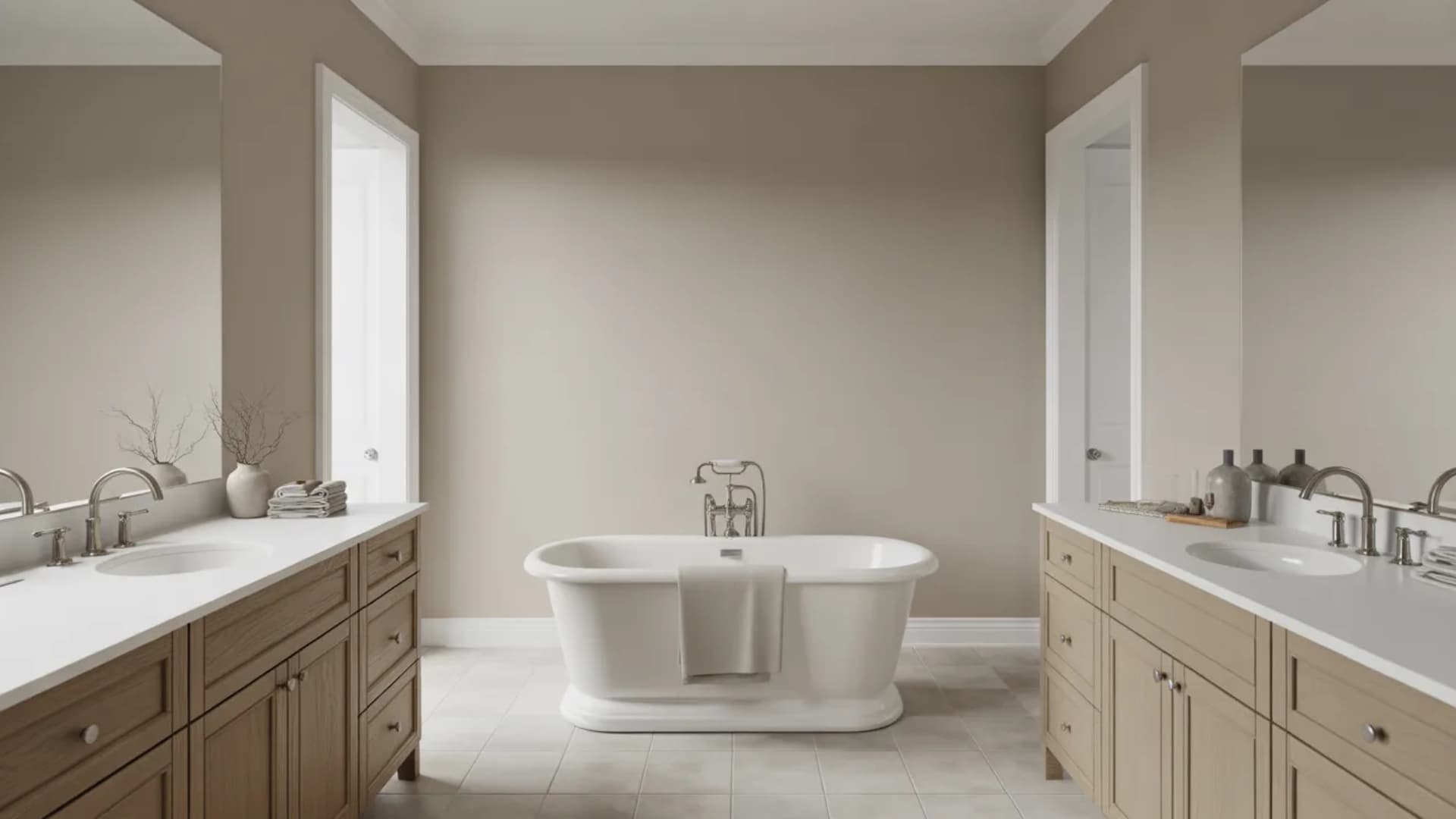
The Best Paint Colors for Bathrooms Right Now
Picking from hundreds of swatches is overwhelming, so I’ve narrowed this list to the bathroom paint colors that designers and homeowners keep coming back to. Every one of these has proven itself in real bathrooms, not just on mood boards.
Whites and Creams
White is the most used color in bathrooms worldwide, and it is easy to see why. It reflects light, works with almost any fixture or tile, and never feels out of place. The challenge is that no two whites are the same.
Some pull warm, some pull cool, and the wrong one in the wrong bathroom can make the whole space feel off. These four whites are the ones that consistently work across different bathroom sizes, lighting conditions, and styles.
1. White Dove

Hex: EFEEE5
White Dove carries a soft yellow-gray undertone that keeps it from feeling cold or clinical on the wall. It works well in both small and large bathrooms because it reflects light without washing the space out.
In low light, it stays warm and inviting rather than turning harsh. If you want a white that feels comfortable and lived-in rather than sterile, this is the one to start with.
- Best for: Small bathrooms and master baths
- Pairs with: Brass fixtures, natural wood vanities
- Best finish: Satin
2. Chantilly Lace

Hex: F4F6F1
Chantilly Lace is a crisp, clean white with a barely-there green-gray shift in certain lighting. It makes tile grout look sharper, and fixtures look more polished. Designers reach for it when they want a bathroom to feel fresh and modern without any warmth pulling the look away.
It reflects light exceptionally well, making it one of the strongest choices for smaller bathrooms where you want everything to feel open.
- Best for: Modern bathrooms of all sizes
- Pairs with: Chrome, brushed nickel, white subway tile
- Best finish: Semi-Gloss
3. Alabaster

Hex: EDEAE0
Alabaster sits between a true white and a warm cream. Its gentle beige pull stops it from feeling stark, which makes it one of the best options for bathrooms without natural light. In dim spaces, most whites turn flat and gray. Alabaster stays soft and comfortable instead.
It works especially well with soft gold accents and light stone countertops, where its warmth ties the whole room together.
- Best for: Windowless bathrooms and cozy spaces
- Pairs with: Soft gold accents, light stone countertops
- Best finish: Satin
4. Pure White

Hex: F5F4EF
Pure White sits right in the middle of warm and cool, which means it does not clash with warm-toned tile or pull away from cool gray fixtures. It is the go-to choice when you are unsure which direction your bathroom leans, and you want a white that simply works.
Small bathrooms benefit from it most because the balance in its tone keeps the space feeling bright without feeling cold.
- Best for: Small or well-lit bathrooms
- Pairs with: Any tile or fixture color
- Best finish: Semi-Gloss
Blues, Greens, and Spa Tones
Blue and green are the most requested bathroom colors right now, and the reason is simple. They bring a sense of calm into a space you use to start and end your day.
From barely-there pastels to deeper, moodier tones, this category covers the full range. Whether your bathroom is small and bright or large and dim, there is a shade here that will make it feel like a place you actually want to spend time in.
5. Sea Salt

Hex: CDD2CA
Sea Salt is one of the most used bathroom colors of the past decade, and it still holds up. It shifts between green, blue, and gray depending on the light, which makes it feel alive on the wall throughout the day. In the morning, it leans green.
In the evening, under warm light, it pulls more gray. It is a chameleon color that suits almost any bathroom style without ever feeling like a bold commitment.
- Best for: All bathroom sizes, spa-inspired spaces
- Pairs with: White trim, brushed nickel fixtures
- Best finish: Satin
6. Palladian Blue

Hex: C1D1C9
Palladian Blue sits right between blue and green, giving it a fresh, airy quality that works especially well in bathrooms with good natural light. In bright conditions, it takes on a soft, almost watercolor appearance.
It is calm without being cold, and light without feeling washed out. Guest bathrooms and coastal-style spaces benefit most from it, where the goal is to feel welcoming and relaxed.
- Best for: Guest bathrooms, coastal-style spaces
- Pairs with: White trim, marble countertops
- Best finish: Satin
7. Rainwashed

Hex: C2CDC5
Rainwashed reads greener and brighter than Sea Salt, which gives it more presence on the wall. It works best when surrounded by plenty of white, like white tile, white trim, or white cabinetry, which keeps it from feeling too vivid in a smaller space.
On larger walls without white to balance it, it can surprise you with how much color it actually has. Use it with intention, and it rewards you with a bathroom that feels genuinely refreshing.
- Best for: Bathrooms with white tile and marble
- Pairs with: White accents, chrome fixtures
- Best finish: Satin
8. Guilford Green

Hex: CECAAD
Guilford Green is a muted sage that feels grounded and natural rather than trendy. It has just enough gray in it to keep it from reading as a pure green, which gives it a sophistication that works well in master baths.
Brass fixtures and warm wood vanities sit beautifully against it. If you want a green that feels organic and timeless rather than fashionable and fleeting, this is the one.
- Best for: Master baths, nature-inspired spaces
- Pairs with: Brass fixtures, wood vanities
- Best finish: Satin
9. Healing Aloe

Hex: D5DBD2
Healing Aloe is one of the most adaptable greens available. It is pale enough to work in a small bathroom without making the space feel overwhelmed by color, yet it has enough presence to register as a genuine design choice.
It sits well alongside a wide range of tile colors and cabinet finishes, which makes it a reliable option when you want a soft, nature-inspired feel without locking yourself into one specific style.
- Best for: Any bathroom size
- Pairs with: Any decor style
- Best finish: Satin
10. Breath of Fresh Air

Hex: C9DDE5
Breath of Fresh Air is a powdery pastel blue that stays so soft it almost reads as a very pale neutral. It works best in compact spaces like powder rooms, where you want a hint of color without the weight of a stronger hue.
Against white wainscoting and chrome fixtures, it feels light, clean, and quietly sophisticated. It is the kind of color that people notice without being able to immediately name what it is.
- Best for: Small bathrooms and powder rooms
- Pairs with: White wainscoting, chrome fixtures
- Best finish: Semi-Gloss
11. November Skies

Hex: ACBBC7
November Skies sits between blue and gray in a way that feels intentional and contemporary. It is cooler than most spa tones, which gives it a sharper, more modern edge.
Matte black fixtures contrast against it particularly well, creating a look that feels high-end without needing much else in the room to support it. It works best in medium to large bathrooms where it has enough wall space to show its full depth.
- Best for: Modern bathrooms, medium to large spaces
- Pairs with: White trim, matte black fixtures
- Best finish: Satin
Soft Neutrals and Grays
Neutrals are the workhorses of bathroom design. They go with everything, hold up well under different lighting conditions, and suit any style from traditional to modern.
The key is knowing the difference between a warm neutral and a cool one, because they behave very differently on a wall. The five shades below cover both ends of the spectrum and everything in between.
12. Agreeable Gray

Hex: D1CBC1
Agreeable Gray sits between gray and beige, feeling warm without ever turning muddy. It is one of the most widely used paint colors in the world, and bathrooms are one of the main reasons why.
It holds its tone well across different lighting conditions, meaning it looks just as good under warm evening light as in the morning. If you want a neutral that has personality without making a statement, this is the place to start.
- Best for: Family bathrooms, transitional style
- Pairs with: Wood tones, warm metal fixtures
- Best finish: Satin
13. Repose Gray

Hex: CCC9C0
Repose Gray leans cooler than Agreeable Gray, giving it a cleaner, more contemporary feel. It suits bathrooms that get a good amount of natural light, where its cool undertone reads as fresh and crisp rather than flat.
It works particularly well in modern bathrooms where the goal is simplicity, and the fixtures and tile do most of the talking. Keep the trim white and the hardware consistent, and it comes together effortlessly.
- Best for: Modern and contemporary bathrooms
- Pairs with: White trim, brushed nickel, or chrome fixtures
- Best finish: Satin
14. Classic Gray

Hex: E3DFD5
Classic Gray is one of the lightest options in this category. In well-lit spaces, it reads almost like warm white, making it a smart pick for smaller bathrooms where you want something neutral that still adds a little depth.
It bridges the gap between a true white and a proper gray, sitting comfortably in spaces where either extreme would feel like too much. It is understated, reliable, and very easy to build a bathroom around.
- Best for: Small bathrooms and bright spaces
- Pairs with: White fixtures and trim
- Best finish: Satin
15. Edgecomb Gray
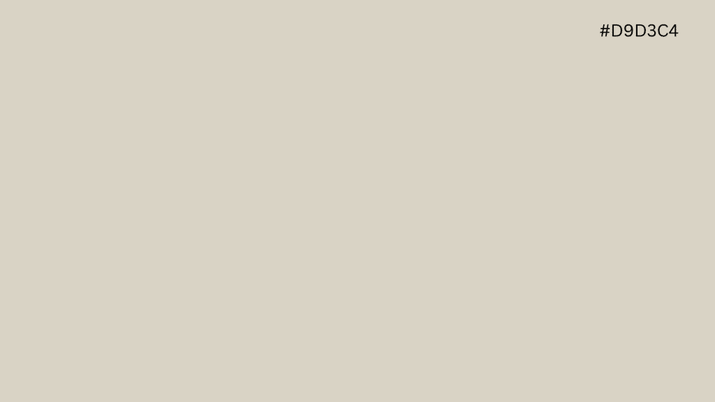
Hex: D9D3C4
Edgecomb Gray lives in the warm space between beige and gray. It has enough warmth to feel inviting but enough gray to stop it from reading as a full beige. That balance makes it a strong fit for traditional and transitional bathrooms where you want something grounded and comfortable.
Warm wood finishes and oil-rubbed bronze hardware sit particularly well against it, giving the whole bathroom a cohesive, settled feeling.
- Best for: Traditional and transitional bathrooms
- Pairs with: Warm wood finishes, oil-rubbed bronze fixtures
- Best finish: Satin
16. Accessible Beige

Hex: D1C7B8
Accessible Beige is a soft, grounding neutral that adds warmth to any bathroom without feeling heavy. It sits warmer than most grays but cooler than a full beige, giving it versatility that works across a wide range of tile and flooring options.
In bathrooms with earthy materials like stone tile or copper fixtures, it feels especially at home. It is the kind of color that makes a bathroom feel settled and considered without drawing attention to itself.
- Best for: Any bathroom needing warmth
- Pairs with: Earth-toned tile, copper fixtures
- Best finish: Satin
Warm and Earthy Tones
Warm and earthy colors bring a sense of texture and comfort into a bathroom that cooler neutrals simply cannot replicate. They work best when the space has decent light, and the fixtures are warm.
Think copper, brass, matte gold, and natural stone. Done right, a warm-toned bathroom feels less like a utility space and more like a room you genuinely want to be in.
17. Pale Oak

Hex: DDD9CE
Pale Oak is one of those colors that looks different in every bathroom, and that is exactly what makes it interesting. It has a warm beige-pink undertone that shifts depending on what surrounds it.
Next to white, it reads as a soft blush. Next to wood, it pulls more beige. It is light enough to work in smaller bathrooms but has enough warmth to feel intentional rather than safe. Gold fixtures and soft white trim bring out the best in it.
- Best for: Traditional bathrooms, warmer styles
- Pairs with: Gold fixtures, soft white trim
- Best finish: Satin
18. Swiss Coffee

Hex: EDEAE0
Swiss Coffee is a creamy off-white that sits warmer than most whites and softer than a true beige. It is the kind of color that makes a bathroom feel genuinely cozy without leaning too far in any one direction.
It works well on both walls and cabinetry, which gives it more flexibility than most colors in this category. If you want warmth without committing to a full earthy palette, Swiss Coffee is one of the most reliable ways to get there.
- Best for: Cozy, inviting bathrooms
- Pairs with: Both traditional and modern decor
- Best finish: Satin
19. Revere Pewter
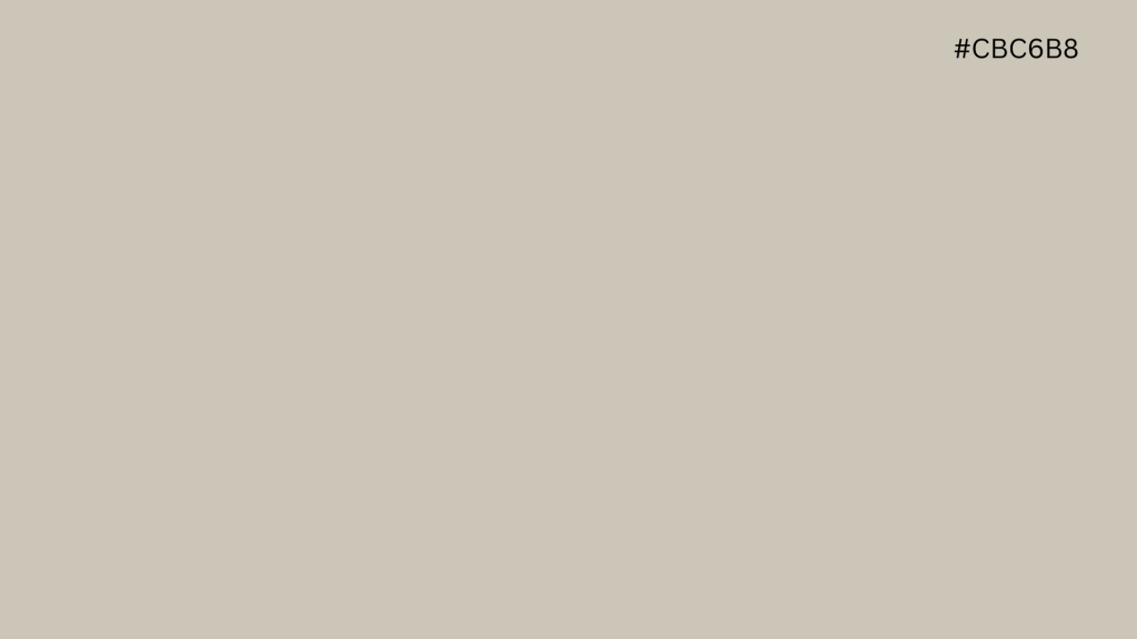
Hex: CBC6B8
Revere Pewter is one of the most enduring neutrals in interior design. It adds depth and richness to a bathroom without going dark, which makes it a strong choice for spaces where you want something grounded and layered.
It has a warm gray-brown undertone that responds well to natural light, picking up different qualities throughout the day. In medium to large bathrooms with warm stone or dark wood, it creates a bathroom that feels complete and considered.
- Best for: Medium to large bathrooms
- Pairs with: Dark wood, oil-rubbed bronze, warm stone
- Best finish: Satin
20. Cavern Clay
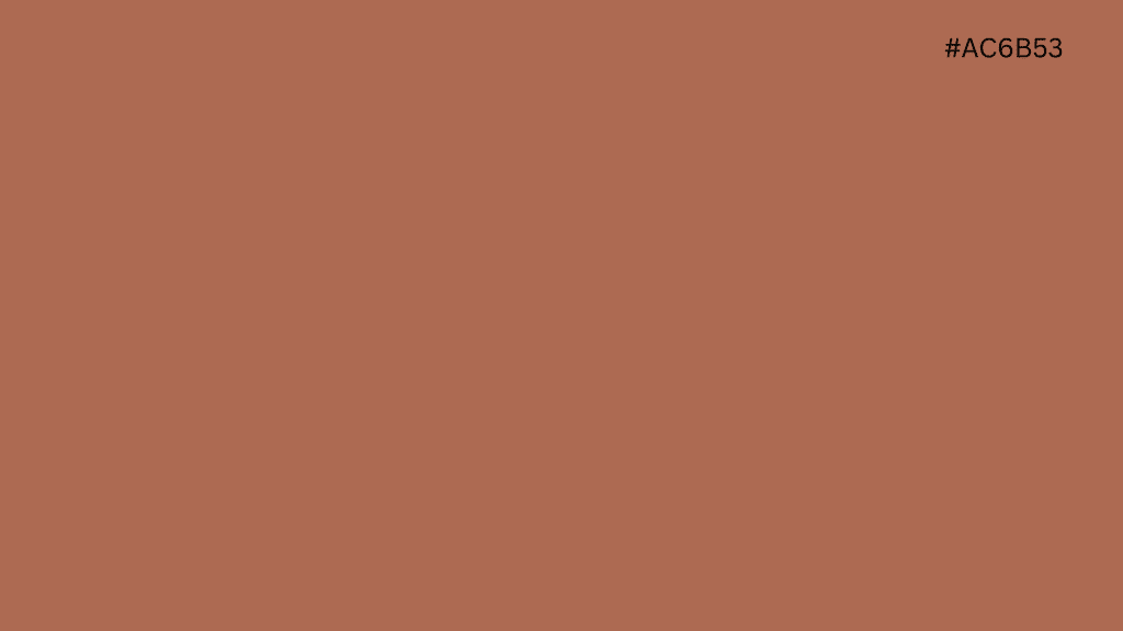
Hex: AC6B53
Cavern Clay is the boldest pick in this category and the one most likely to make a bathroom feel genuinely different. Its warm terracotta tone evokes the feel of natural clay and sun-baked earth in the room. It is not a color you ease into. It makes an immediate impression.
Paired with natural stone tile, matte brass, or copper fixtures, it creates a bathroom that feels rich, grounded, and completely its own. Best used in bathrooms with good light, so the warmth does not overwhelm the space.
- Best for: Bold, rustic-style bathrooms with good light
- Pairs with: Natural stone tile, matte brass, copper fixtures
- Best finish: Satin
Bold and Statement Colors
These colors are not for every bathroom. They are for the ones where you want to walk in and feel something. Powder rooms are the best place to try them because the smaller the space, the more impact a strong color has.
Larger master baths can carry them too, but the fixtures and materials need to be up to the task. Get the pairing right, and these three colors will make your bathroom the most talked-about room in the house.
21. Hale Navy

Hex: 434B56
Hale Navy is a deep, rich navy that turns a plain bathroom into something that feels intentional and considered. It is dark enough to create real drama but balanced enough to avoid feeling oppressive.
In a powder room, it creates an instant jewel box effect, especially against white trim, where the contrast is sharp and striking. Gold and chrome fixtures both work well against it, giving you flexibility depending on which direction your bathroom leans.
- Best for: Powder rooms, large master baths
- Pairs with: White trim, gold or chrome fixtures
- Best finish: Semi-Gloss
22. Aegean Teal

Hex: 6F898B
Aegean Teal sits right between blue and green, giving it a depth that is harder to pin down than a straight navy or a clean sage. That ambiguity is what makes it so interesting on a bathroom wall. It feels both calming and striking at the same time.
Natural wood and warm brass sit beautifully against it, softening its depth and keeping the space from feeling too cool. It works as an all-over color or as a strong accent wall behind a vanity.
- Best for: Accent walls, powder rooms, statement baths
- Pairs with: Natural wood, warm brass, white stone
- Best finish: Satin
23. Mysterious

Hex: 454B54
Mysterious is the darkest color on this list, and it earns that spot. It is a deep, moody navy that absorbs light rather than reflects it, creating a bathroom that feels completely removed from the rest of the house.
It works best in larger bathrooms or powder rooms where you want the space to feel like a destination. Gold fixtures and white marble are the natural counterparts to it, cutting through the depth and keeping the room from closing in.
- Best for: Dramatic powder rooms, large bathrooms
- Pairs with: Gold fixtures, white marble, wood accents
- Best finish: Semi-Gloss
Pastels and Soft Pinks
Pink, blush, and lavender tones have made a strong comeback in bathroom design. They’re not the bubblegum shades from the ’80s. The current trend leans toward muted, sophisticated pastels that warm up any bathroom and look especially good under soft or low lighting.
If your bathroom has chrome fixtures and white tile, a soft pink or lavender creates unexpected contrast without overwhelming the space.
24. First Light

Hex: #F0E4DB
First Light is Benjamin Moore’s soft blush-pink that barely reads as pink on the wall. It has enough warmth to add personality without committing to a full pink bathroom.
In natural light, it shifts toward a warm neutral. Under warm bulbs, the pink comes out more. It’s a flattering color, both for the room and for your reflection in the mirror, making it a smart choice for bathrooms where you get ready every day.
- Best for: Powder rooms, master baths with warm lighting
- Pairs with: Brass or gold fixtures, marble tile, warm wood
- Best finish: Satin
25. Misty Lilac

Hex: #E3D8E3
Muted lavender tones are trending in 2026 as homeowners move toward softer, more expressive colors. Misty Lilac is calm without being cold, with gray undertones that keep it from reading as overly sweet.
It pairs well with brushed silver or chrome fixtures and looks particularly good in smaller bathrooms where you want a hint of color that still feels restful. If sage green feels overdone in your neighborhood, lavender is the unexpected alternative that still delivers spa energy.
- Best for: Small bathrooms, guest baths, powder rooms
- Pairs with: Chrome fixtures, white tile, soft gray accents
- Best finish: Satin
How Do You Test a Bathroom Paint Color the Right Way?
Picking a color you love on a chip and hating it on your wall is one of the most common paint mistakes. And it’s almost always avoidable. The problem is rarely the color. It’s how you tested it.
A few deliberate steps before you buy a full can will save you time, money, and the frustration of repainting.
1. Buy at least two samples: Testing a single color gives you nothing to compare against. Two or three options side by side make differences in undertone far easier to spot.
2. Use a foam board, not the wall: A foam board lets you move the sample around the bathroom without committing paint to your walls. Hold it next to your tile, your vanity, and your flooring to see how the color interacts with each surface.
3. Check it three times a day: Morning light, afternoon light, and evening light with your bathroom fixtures on will each show you a different version of the same color. That shade that looked perfect at noon? It might turn muddy at 9 PM.
4. Test it near the mirror: Mirrors bounce light in ways that change how a color reads on surrounding walls. Placing your sample near the mirror gives you the most accurate preview of the final result.
5. Wait 48 hours before deciding: One glance is never enough. Give yourself two full days with the sample on the board before making a final call. Your eye adjusts, and what you think you love on day one sometimes feels different on day two.
I always tell clients to test their top two picks side by side on the same foam board. The differences between similar shades are nearly impossible to see in isolation, but the second you put them next to each other, one will immediately feel right and the other won’t.
That ten-dollar investment in an extra sample has saved more clients from expensive repaints than any other tip I give.
What Bathroom Paint Colors Make a Small Space Look Bigger?
If you’re working with a small bathroom, the right color can make it feel noticeably more spacious. Light, reflective shades are your best bet: White Dove, Chantilly Lace, Classic Gray, and Breath of Fresh Air all perform well in tight spaces because they bounce light around the room instead of absorbing it.
That said, “go light” isn’t the only strategy. A small powder room can actually benefit from a bold, dark color like Hale Navy or Mysterious. The trick is committing fully: paint every surface the same shade, trim included, and the walls seem to dissolve.
The eye stops registering where the wall begins and ends, which makes the room feel larger than it is. Pair with good lighting and a large mirror, and you’ll be surprised how much room you seem to gain.
One of my favorite projects was a 35-square-foot powder room where the homeowner was dead set on white. I talked her into trying Hale Navy on a foam board, and she called me back two days later, completely converted.
The dark color made the space feel like a little jewel box instead of a cramped closet. Sometimes breaking the “light colors only” rule is exactly the right move for a small bathroom.
Bathroom Paint Color Mistakes to Avoid
Never use matte finish in a humid bathroom. It will peel, bubble, and trap moisture over time. Satin and semi-gloss exist for exactly this reason.
Always prime over dark colors before painting. Skipping it means the old shade bleeds through no matter how many coats you apply.
Do not try to match your paint exactly to your tile. Colors that are too close compete rather than complement. Choose a shade that works alongside your materials, not one that tries to mirror them.
Check the undertone of your chosen color against your actual fixtures in your actual bathroom, not just on a chip under store lighting. The two can look completely different.
Finally, open the bathroom door before you commit. A color that clashes with the hallway or bedroom next to it will bother you every single day.
Conclusion
The best bathroom paint color isn’t the trendiest one or the most popular one on social media. It’s the one that works with your light, your fixtures, your tile, and the way you want the room to feel when you walk in at 6 AM and again at 10 PM.
Start with the finish. Check your undertones. Test with foam boards, not guesswork. And don’t skip the 48-hour wait before you decide.
Every color in this guide was chosen because it performs in real bathrooms with real lighting, not just on mood boards. If one of them ends up on your walls, I’d love to hear how it turned out.
And if you know someone staring at a wall of paint swatches right now, send them this list. It’ll save them a few headaches.
FrequentlyAsked Questions
What Colors Make a Bathroom Look Expensive?
Deep navy, warm white, and soft sage green make a bathroom look expensive. Pair them with brass or matte black fixtures for a high-end feel.
What Is a Timeless Bathroom Color?
White, soft gray, and pale blue are timeless bathroom colors. They work with any fixture style, hold up across decades, and never feel dated or out of place.
What Color Not to Paint a Bathroom?
Avoid bright yellow, orange, and neon shades. They clash with most fixtures, make small spaces feel smaller, and are the first colors people want to repaint.
What Makes a Bathroom Look Outdated?
Dated bathrooms often have beige walls, pink or mint tile, and brown fixtures. Outdated paint colors paired with old hardware make the whole space feel stuck in time.